Talk about Real Estate, Home Decor, and more related topics.

Thursday, June 28, 2012

Decor Shopping…Penney and Company

I have been a fan of Michael Penney’s since his early days with Canadian House and Home.  He has since left the magazine and then did a season working on Sarah 101 with Sarah Richardson and Tommy Smythe (currently airing Tues nights on HGTV Canada.)

His latest venture is opening up his very own store in Whitby (Ontario) filled to the brim with everything quintessentially Michael. He is also taking on decorating clients, so if you live in the area, it’s certainly something to consider.

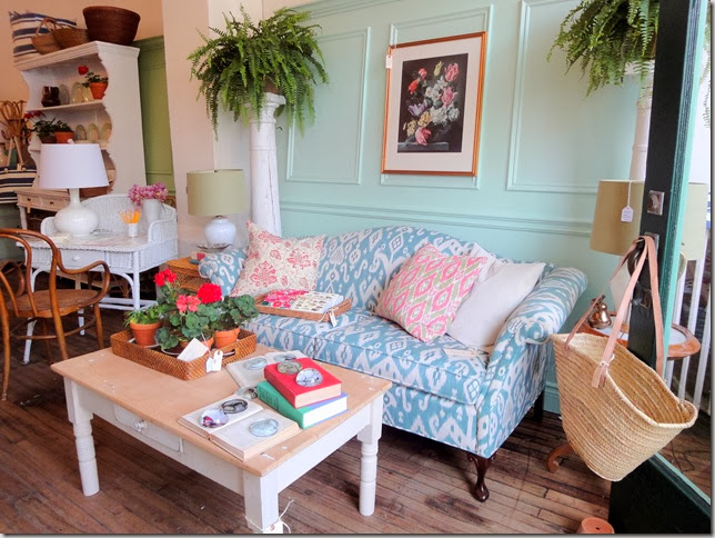
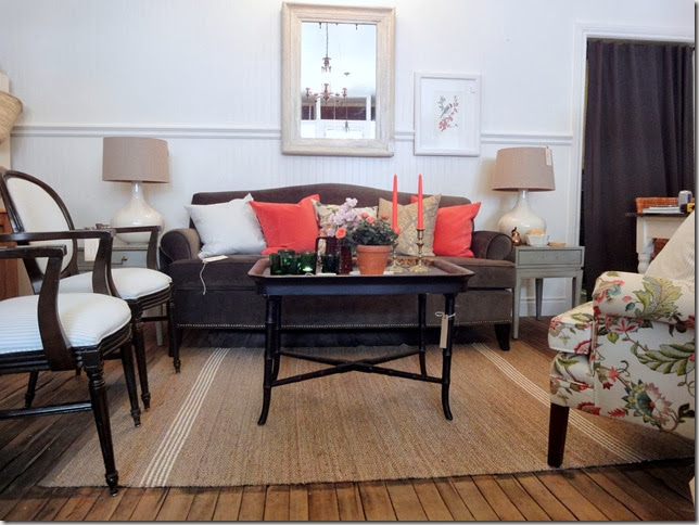
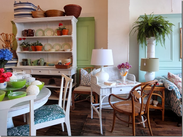
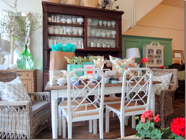
My sister lives in Whitby so whenever I go to visit, we always stop in to see what’s new as Michael is always bringing in new and interesting pieces.  (I snapped these photos on a visit there last month so some of the items may not be available.)

MP6

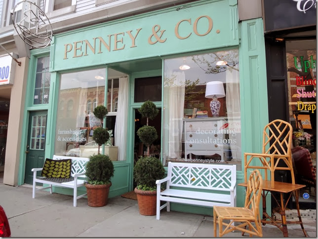
Love the exterior of his shop painted Farrow and Ball’s Arsenic, one of Michael’s favourite paint colours.  It definitely causes passersby to stop and take notice.  Another smart idea is having your website address on your storefront window.

MP9

He related that a woman bought this sofa without seeing it in person. It certainly is a showstopper!

MP1

When I interviewed him early last year, this is what he had to say about his style: “ the common thread is traditional elements mixed with fresh colours and casual comfort.  I like to reinterpret the work of the decorating greats through a modern, more loose perspective.  I can get into modern and edgy looks, but my heart strings are always pulled most by fresh, colourful and effortlessly comfortable rooms.”
MP2

 MP5

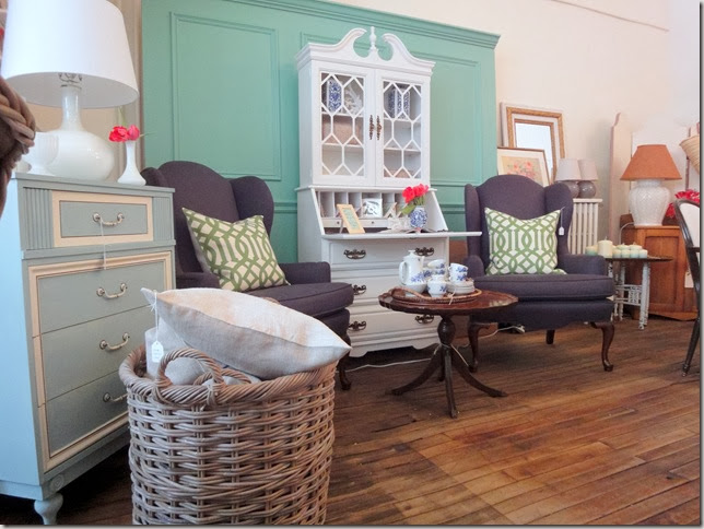
I bought the wicker table that’s beside the sofa with plans on painting it black or a fun colour for possible use in my bedroom.

MP7

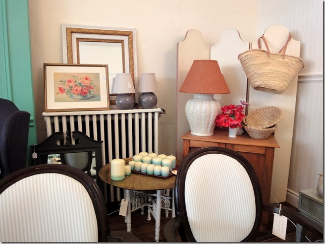
You may recognize these chairs from the June, 2012  issue of Style at Home.

MP8

In this photo, you can see where the pool tables were when the  store was a pool hall for many decades.  

MP4

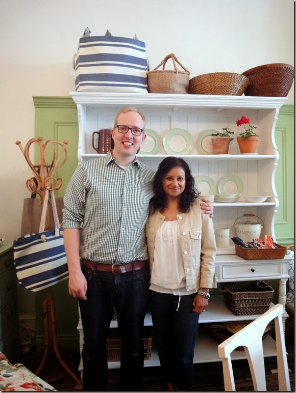
I look so tiny compared to Michael (I’m really not that short – he is very tall!)  We had a lovely chat about the history of the store, items for sale and decorating in general.  If you haven’t been to Penney and Company, it’s definitely worth the drive to Whitby!
Read More

Tuesday, June 26, 2012

Outdoor Sectional

My vision for our small suburban backyard always included a sectional on the patio. There is just something about them – they create a relaxed, intimate atmosphere when entertaining and are comfortable enough to lie down on and read a book or even take a nap.  (That’s what the hubster is looking forward to!  He’s going to hate me for saying that!)

DSC04079

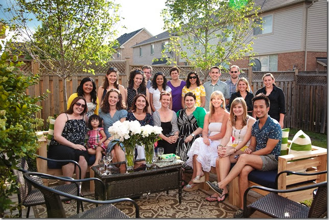
See? Don’t the eight of us on this sectional look comfortable and cozy?   This photo was taken after BlogPodium when a few of us decided to head to a patio for some food, drinks and more chit chat.  (PS Recognize any of your favourite bloggers?)

I had perused retail sites looking for a sectional with the required dimensions – 96” x 96”.  If you’re going to have a sectional, might as well be big! I figured this size would easily accommodate eight people.

When I found Ana White’s Outdoor Sectional Plan online, I knew it would be perfect.  (In case you haven’t heard of White, you can read an interesting article about her here.)  The sectional is made up of 24” x 24”  individual pieces so it’s easy to reconfigure, carry, store etc.  She recommends securing the sectional pieces together but I will see if that is necessary.

Simple Modern Outdoor Sectional Armless Section

via Ana White

Now I just needed someone to build it.  I’m pretty handy and have taken woodworking courses in the past and built furniture but time was an issue!   I remembered reading about a table built by Kerry’s Dad, Jim, on Shannon’s blog.  Lucky for me, he was available to build the sectional.  He worked on it diligently for two days, modifying the plans somewhat to accommodate the wood sizes that were different from those specified in the plans.  I used 5/4 x 6 x 8 premium cedar used for decks from the Home Depot.

DSC04211

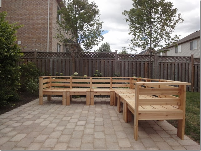
Here it is sitting nicely (but looking a bit naked) on our new patio.  I was thinking of staining it a dark grey but think I will just apply a clear topcoat and retain the light wood colour.  Any thoughts?

Leah1 Photo credit:  Leah Kirin

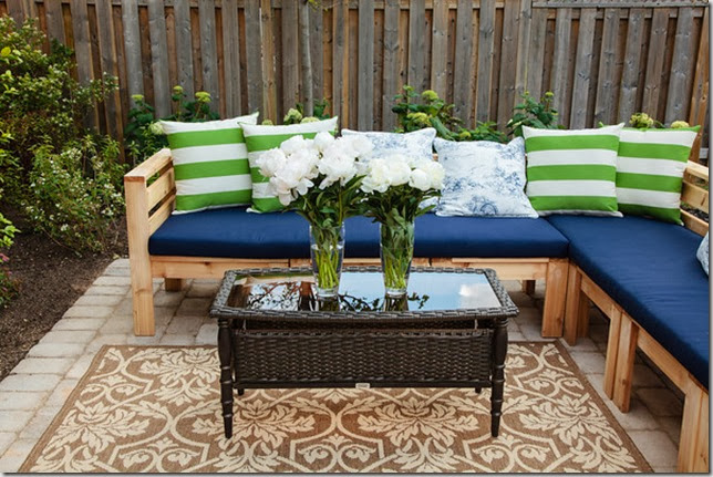
This is how it looked on Saturday evening for the Blogger Backyard party sponsored by the Home Depot.   What do you think? 

The green striped cushions and the seat cushions were custom made by Tonic Living using outdoor fabric. 

The table and outdoor rug from Home Depot were brought in for the party.

Leahgroupshot Photo credit: Leah Kirin

Here is (almost) everyone that was at the Blogger party.  (Will do a post once I have all the photos!)  There are 8 1/2 people on the sectional and looks like one more could squeeze in!  I love it and I envision spending more time outdoors now especially in the evenings chatting with friends over a good bottle of wine!

Hope you have a great week!

(This post is sponsored by the Home Depot.)

If you require decorating advice, contact me at vanessa(at)vanessafrancis(dot)com.

Read More

Friday, June 15, 2012

Backyard Makeover

First of all, thank you so much for the lovely comments on my last post, plus your tweets, FB messages and emails!  

So, while I have been busy making some minor changes to the interior of the house, I also have a backyard landscape project on the go.

lovely

(no that’s not me in this absolutely adorable backyard about to welcome guests)

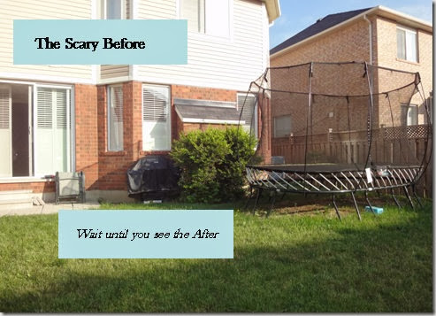
We have lived in our house for seven years and the backyard looked like this: 

backyardbefore
(the trampoline is a lot of fun though) 

So when the Home Depot contacted me to host a Blogger Backyard party, I was going to decline. Wouldn’t be fun to be wearing heels on grass, right? But it’s the Home Depot and it’s a party, how could I say no?

I always wanted to have a patio but it was put on the backburner as there was always something else (house interior, travel) that was the priority.  

So what better way to get my a#% into gear than this!

When designing a backyard, it’s always nice to have a hard surface such as a deck or patio, a garden and grass. 
 Decor Precast - Earth Blend Abbeystone Paver - 10109014 - Home Depot Canada
This is the paver I chose.  When the salesperson at my local HD store said it is rough and looks aged, it just sealed the deal as that is exactly the look I was going for. 

You can use either the smooth side like I did or the other side which has a textured/bumpy appearance. I am having them laid in a brick pattern.

Pavers

These pavers are similar in colour to the ones I chose.
I am also having an outdoor sectional made in time for the upcoming party – another post about the decoration part coming soon and of course the final reveal!

Is your backyard (or balcony) your hideaway? Or has it been put on the backburner?

This post is sponsored by the Home Depot.  Check out their site/stores for everything for your outdoor needs from building supplies to furniture and barbeques.
Read More

Friday, June 8, 2012

My BIG News!!

OK, I cannot keep this from you any longer!

I’m about to have a dream come true…

No, not expanding our family…

Nor did I win the lottery…although that would be nice.

2011

via Pinterest

I am going to be published in one of my favourite decor magazines, Style at Home! Yes, that magazine. I know, right?

this issue

So how did it come about?…After the Steven and Chris shoot I hired this photographer to come in the next day and shoot the four rooms because they never looked so good.  Best money I ever spent!

Only two rooms had made it to air on the show.  I sent the photos  to Style at Home (with much support from my business coach :) ), waited (not so) patiently and then received an email from one of their editors.  She said “everyone loves your place.”  So exciting!

I think that is every decorator/designer/stylist/blogger’s dream, isn’t it? To be published in a first rate magazine.

So true.

via Pinterest

When I was at Blogfest 2012, Darryl Carter advised us to work on our own homes, get it photographed and submit those photos to the magazines. Sometimes mag editors find you through your blog too.

polished-casual-outdoor-space-lo.jpg

Tim’s balcony via Style at Home

I’m following in the footsteps of two of my favourite bloggers and friends Jen and Tim who have had their lovely homes featured in Style at Home this year. 

 rambling-renovators-bath.jpg

Jen’s bathroom via Style at Home (love that door!)

So, there you have it! My BIG news! Now what are you waiting for? Go forth and decorate your home, get it photographed and #getpublished.

And another.

via Pinterest

Gotta run! Tonight is my sweet daughter’s 10th birthday party at the house. It’s an 80’s theme complete with colourful Madonna-esque clothing, Michael Jackson music and chocolate fondue (although, I think the latter is more 70’s than 80’s!) 

Have a happy weekend!

If you need decorating help, please contact me at vanessa(at)vanessafrancis(dot)com.

Read More

Tuesday, June 5, 2012

Style at Home’s Summer Trend Report

Yesterday was a somewhat sunny day – a nice change from the dreary weather we have been having here in the burbs of TO.  I’m ready for summer!  Aren’t you? I love decorating at this time of year – changing slipcovers, area rugs, pillows and accessories – to give the house an airier, breezy feel.

The folks over at Style at Home shared what they see as three trends for Summer decorating and I have to agree -  loving them all!

1.  Aegean blue:
decor-aegeanblue-tile


decor-aegeanblue-pillow

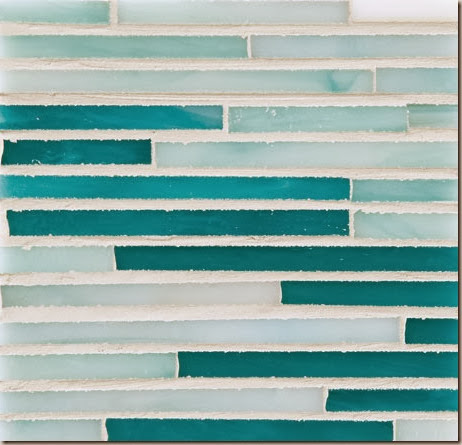
Aegean blue can be any number of shades of blue ranging from turquoise to indigo – the colours of the Aegean sea.    I find that I never seem to tire of the colour blue in all of its shades. 

Love the backsplash from Ravenna and the West Elm pillow above – I feel so happy just looking at them!  You can see more aegean/blue inspiration here.

2. The Kilim
english2.jpg

Although I don’t  necessarily associate kilims with summer decorating, their bold colour and graphic pattern can certainly liven up a space.  Kilims are hard wearing and therefore perfect in an entry way or just about any room in the house. It’s versatility means it can work with just about any style and aesthetic. Love how it  works with the damask print on the chair and the leopard carpet on the stairs in the above image.  You can see how it works in a High/Low story here.

3. Country Colours
country-colour-white-house  All images via Style at Home
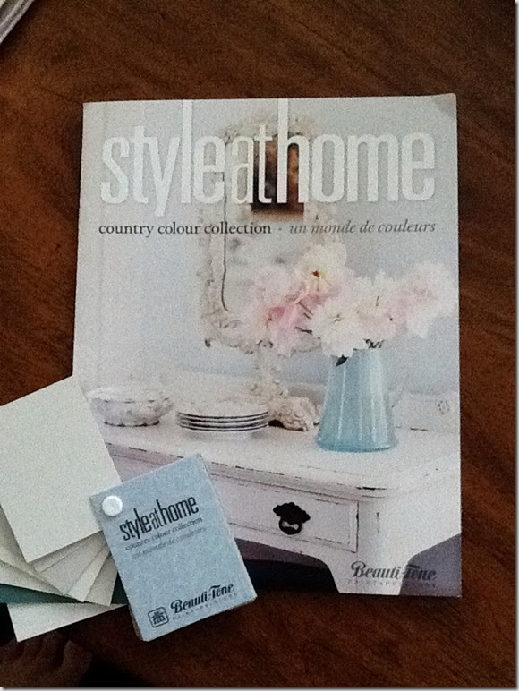
Back in 2010, I mentioned that Style at Home had introduced a collection of paint colours with Beauti-tone paints.  They recently introduced a “Country Colours” palette and I was told by the staff at my local Home Hardware (where the paint is sold exclusively) that these are the same colours that were out before the 2010 launch but have been rebranded and brought back due to its popularity.

countrycolours

Hint: Choosing a paint colour from a well-edited collection of 50 colours like this is so easy.  They have done all the guess work for you!  You can read about the collection here and here.  I am drawn more and more to a lighter, airier palette as in the ones I chose from the fan deck above.

Happy Wednesday! I’ll be back with my Blogfest and BlogPodium posts later – so much to write so little time!  I also have some exciting news to share!
Read More
Powered by Blogger.

© You Where There Too, AllRightsReserved.

Thanks to Shenmal Fashion Club