Talk about Real Estate, Home Decor, and more related topics.

Friday, August 31, 2012

Design Inspiration…Victoria Hagan

Happy September (sniff, sniff!)

One of the questions posed to me in the Style at Home interview was “If  you could shadow any designer for a day who would it be?”

There are so many brilliant designers whose careers I have followed and whose work I have studied and admired.  But I had to pick one and Victoria Hagan came to mind immediately.  She is a NY based interior designer who has been in the biz 20+ years and has been published in just about every shelter magazine. She also penned a book “Victoria Hagan: Interior Portraits.”

vh-portrait

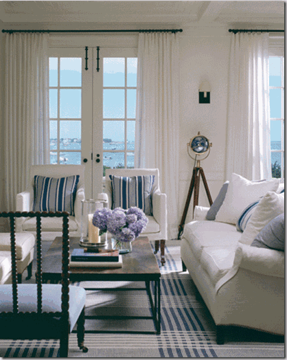
I still have this September 2007 issue of Elle Decor (you know I’m a bit of a magazine hoarder) on my bookshelf in my home office. On the cover is the living room of a Hamptons home Hagan designed.  I love the neutral backdrop with the shots of colour and that she used a hint of mint and chartreuse even though they don’t relate to anything else in the room. Love all of the textures, the wall panelling and the livable and relaxed vibe.

ELLE DECOR September 2007 Cover
I still love this cover 5 years later.

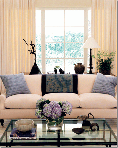
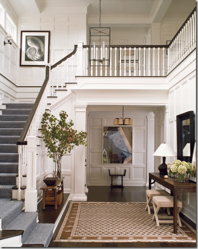
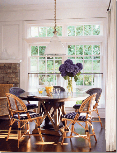
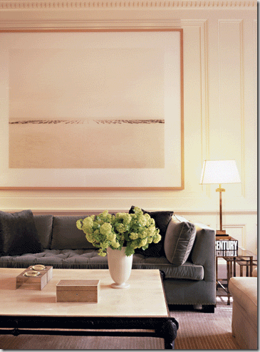
Here are some other inspirational images from her portfolio for you to enjoy! I must admit I’m drawn to the work featured in her “Waterside” portfolio.
 Victoria Hagan 2


Victoria Hagan 4


Victoria Hagan 3


Victoria Hagan 9 
 Victoria Hagan 5


Victoria Hagan 8
All images via Victoria Hagan

What do you think? If you had to answer that question, which designer  would you choose?

Have a happy long weekend (to those in Canada and the US!)
Read More

Wednesday, August 29, 2012

Where I Have Been...

Hi there! Are you enjoying the last week before school starts? I took this week off work (sorry clients!) to spend it with my daughter and friends/cousins. Trying to squeeze a lot of fun things in like bike rides, picnics and Wonderland during summer's fleeting moments.

I also paid a visit to my friend Tim's blog talking about one of my favourite decor elements - wallpaper.  You can read the post here.

Photo Credit: K West Images


I also found myself on the West Elm Blog and Facebook page. You can read their blog post here. The West Elm striped shower curtain and this bathroom I designed is well-loved!

 Front & Main


stripe-shower-curtain-modern-new-bathroom-style-vanessa-francis-west-elm-gray-grey


PS Thanks for all the lovely comments on my last post. I REALLY appreciate it! If you have seen the magazine article, let me know your thoughts!

 
Read More

Monday, August 27, 2012

“Pretty Together”...Style at Home Feature

Happy Monday! Hope you enjoyed a beautiful weekend. I was at a friend’s cottage for a few days and had too much fun!

While driving back from the cottage, I read with excitement,  this tweet (well, I wasn’t driving, I was stopped for lunch, promise!):

tweet

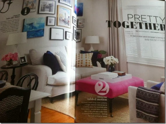
And then she tweeted this photo so I could at least see the first page. Thanks Amy!  (Sorry about the crease - this one photo is spread over two pages.)

Vanessa Francis Design

I did manage to pick up a copy (or seven!) and couldn’t wait to see the layout, words etc.  I like how they included 11 lessons throughout the article. I had seen the photographs before because I had these photos shot in March and Style at Home decided to use them.  (I would have styled things a bit differently had I known these were going in the magazine as is!)

My photographer did re-shoot the living room with my new hot pink ottoman as well as a couple of other images. I LOVE the side view shot of the living room shown above.  

The rooms featured in the magazine are the living room, Maya’s bedroom and craft room.  You have seen variations of these rooms over the years.  You can sort of see the dining room in the photo above.  I will do a Before and After post in the coming weeks as I have never shown the dining room on the blog before. 

Thanks Style at Home for this wonderful opportunity to be featured. It really is a dream come true and I am so grateful!

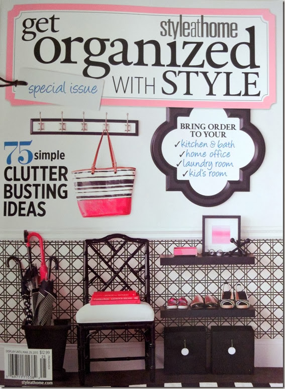
Get Organized with Style

“Get Organized with Style” is filled with inspiration aplenty to create an organized (and pretty) home!  I find that September, the start of a new school year, is the perfect time to edit, declutter and get organized.

This special issue will be on newsstands only (not with your subscription) until March 29, 2013 so you have lots of time to pick one up (but I would buy one sooner than later in case they run out!)   I’m not sure if it is available outside of Canada or on Zinio but I’ll find out.

Have a happy week!

Read More

Wednesday, August 22, 2012

Random Thoughts on a Wednesday…

Hi there! Can you believe that there are only 2 more weeks until school starts? This summer for some reason just seemed to sail by so quickly.  I have been trying to balance work and take time to enjoy this amazing weather with my daughter. (I hate the heat so this mid-2o degree C weather is just perfect!)

1) I forgot to mention that my latest ideabook for Houzz went live a couple of weeks ago.  It’s titled “Creating a Patio for the Whole Family to Enjoy” and includes some functional and fun products from my favourite retailers.  You can read it here

I just may purchase this stand alone fireplace for our new patio to extend the use of it into the Fall.

Weber - Wood Burning Fireplace - 2726 - Home Depot Canada

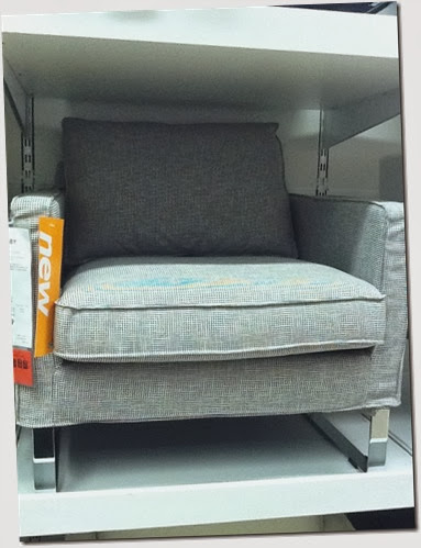
2) As you all know, the new Ikea catalogue is out.  I visited the store early last week to see some of the new products. I loved this chair in this houndstooth fabric and think it may work well in Mr. Decor Happy’s Den. 

Decor Happy

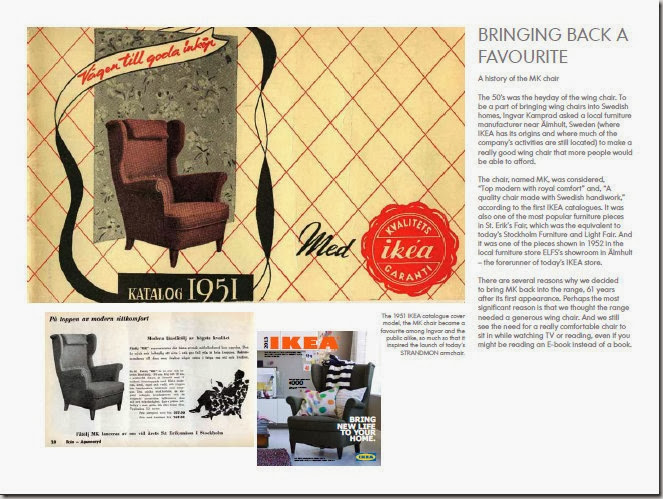
And speaking of chairs, did you see the wing chair on the cover of the catalogue? It is an updated version of a chair they had introduced in 1951 – so cool!  The newer version is available in November and something tells me it will be flying out the store!

via Decor Happy

And Mr. Decor Happy loved this blankie/throw I bought him as inspiration for the room. I had barely taken it out of the packaging when he wrapped himself in it! (It was really quite funny as he doesn’t usually show much interest in any of my house purchases!)   If this blanket knocked his socks off, wait until he sees the room when it is done!

 rick'sblankie

Have you heard about Ikea’s Pin to Win Contest? If you pin one of your favourite images from their Pinterest page, you can win a daily gift card until August 26th!  Go here to start pinning!

3) I tweeted last week that I have a new client that is 80 years old (she volunteered that info to me – I would never ask!)  I have had clients in their 60’s but not 80. I just think that it’s so cool that she would hire a decorator to update her home!  She saw me on a re-run of the Steven and Chris show last week and loved that I repurposed a lot of furniture by either slipcovering, reupholstering or painting.  I’ll keep you posted (her dining room may be a good Before and After!)

4) Speaking of renewing and repurposing, my sponsor Paint it Like New is a wonderful resource if you have furniture (or an entire kitchen), that needs a refresh. They also have an inventory of used furniture pieces that can be sprayed any colour you wish. Or you can purchase one of their ready-to-go upcycled pieces.

Paint it Like New

I’m off to a friend’s cottage way up on the northern Bruce Peninsula for a few days to unplug (well maybe not completely, I’ll probably be pinning and reading blogs while at the beach! )

Hope you enjoy the last few weeks of summer!

Read More

Wednesday, August 15, 2012

House & Home’s Kitchen & Bath Issue

Just wanted to let you know that Canadian House and Home’s Kitchen and Bath issue (special interest publication available on newsstands only) is out.  You will want to pick this up if you are planning a renovation or just love admiring beautiful kitchens (I’m in the latter camp.)

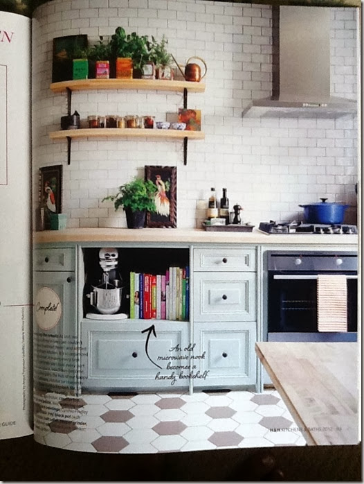
My favourite kitchen in the issue? This one below of H&H Design Editor Kai Ethier’s small bistro kitchen. Can you guess where the cabinetry is from?

House&Home

She picked them up for a steal at a Habitat for Humanity ReStore and painted them this gorgeous blue – Farrow and Ball Light Blue. The subway tiles have a hand-finished quality adding more depth than your regular subway tile.  Go here to watch a H&H online TV episode of Kai explaining how she achieved this look on a budget – so inspiring!

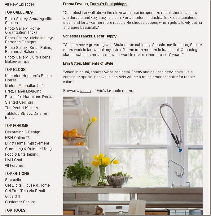
Oh, and go here to read some kitchen design tips from a few bloggers (including myself).

Hous&Homeweb2

Happy kitchen dreaming, planning and renovating!

If you aren’t sure how to pull your kitchen look together or what the best layout is, contact me at vanessa(at)vanessafrancis(dot)com. I would love to help you out!

Read More

Monday, August 13, 2012

New Sponsor…Decor-Rest Furniture

Happy Monday! Hope you had a wonderful weekend.  I worked most of the weekend but I’m not complaining as I love what I do especially when it’s with wonderful ongoing clients!

I’m happy to introduce you to my newest sponsor on the blog.  Welcome Decor-Rest Furniture Ltd!  They are a Canadian fine upholstery manufacturer celebrating 40 years in the business this year.

I own two Decor-Rest sofas – one I have had for years that I recently slipcovered and the other that I will share with you soon!  They offer quality, stylish upholstered pieces at a very affordable price point.

Decor-Rest logo - 40th

The company was started by Angelo and Christina Marzilli who spent their honeymoon at High Point, North Carolina, visiting all the showrooms.  Two kindred spirits!  Their factory and showroom has expanded from 4,000 to 200,000 square feet over the past four decades.

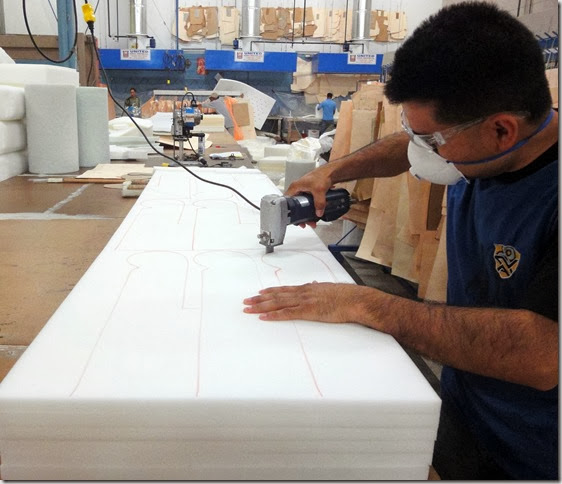
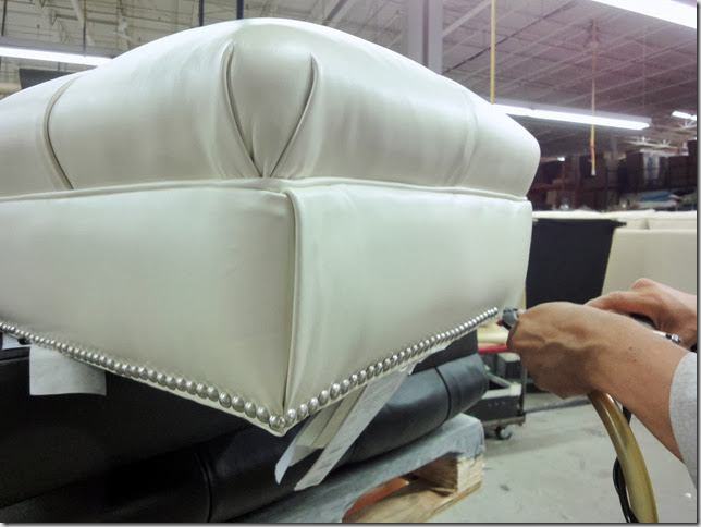
I was happy to receive a tour of the factory to find out how their furniture was constructed. 

Here are just a few photos from the plant floor. Some of their employees have been with them for 40 years – incredible!

Most of the work is done by hand like cutting the leather:
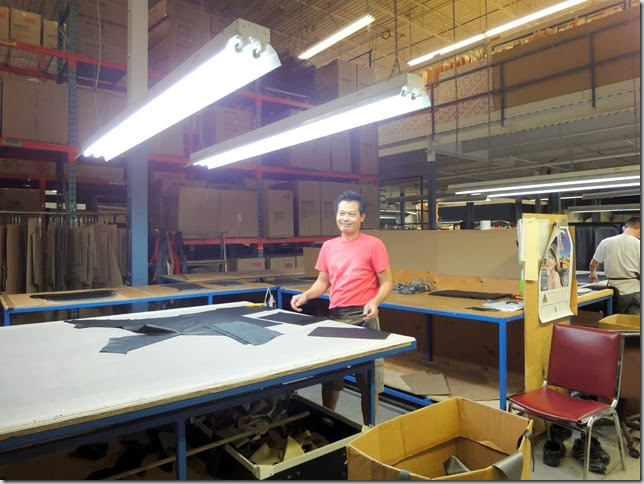
Factory - Decor Rest

Or cutting the foam:

Factory2 - Decor Rest

Or hammering on the nail heads:

Factory3 - Decor Rest

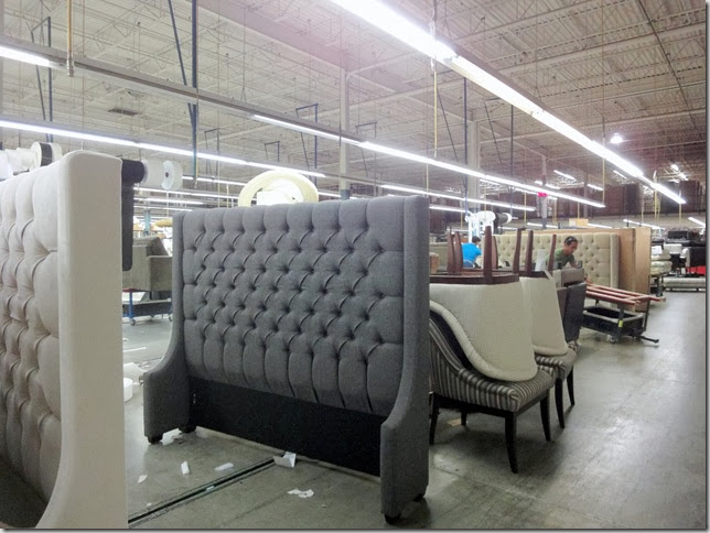
Beautiful headboards waiting to go home:
Factory4 - Decor Rest

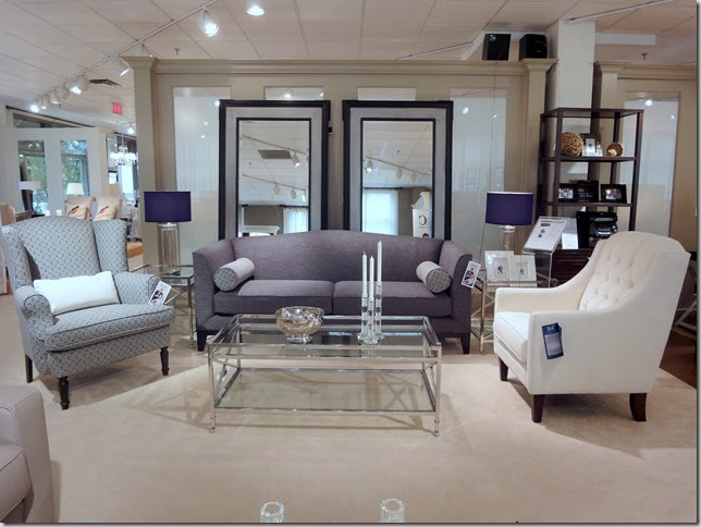
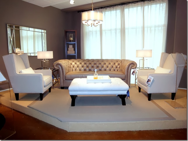
I have never seen an upholstered furniture showroom this large.  They also manufacture the Steven & Chris and Cobi Ladner lines.  A vignette of Steven and Chris furniture in the showroom:
S&C - Decor Rest2

More Steven and Chris:

S&C - Decor Rest

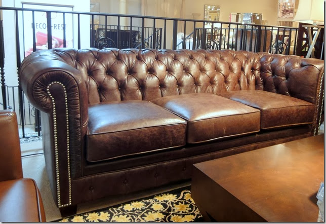
And another chesterfield.  If I had the space, I would definitely consider this for Mr. Decor Happy’s Den.
Chesterfield - Decor Rest

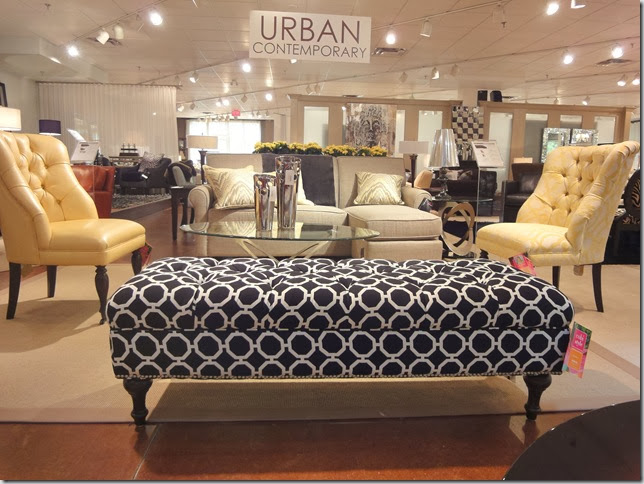
The Cobi Ladner line is fun, colourful and fresh – as can be expected. Love the yellow fabric and leather on these chairs and the graphic ottoman:
Cobi Ladner - Decor Rest

Love the nailheads and the generous size of this sofa:
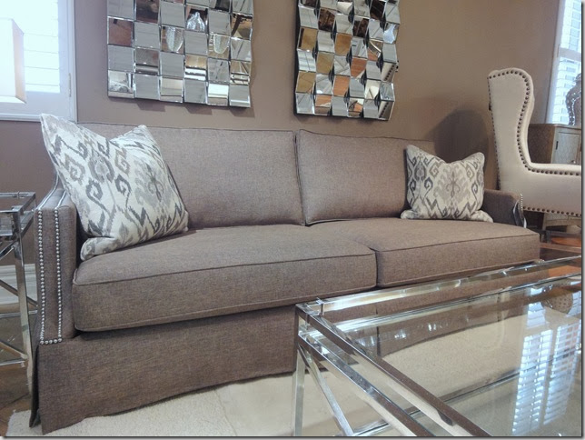
Decor Rest 

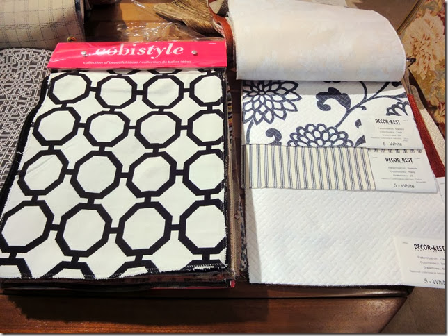
   Impressive selection of beautiful fabrics:
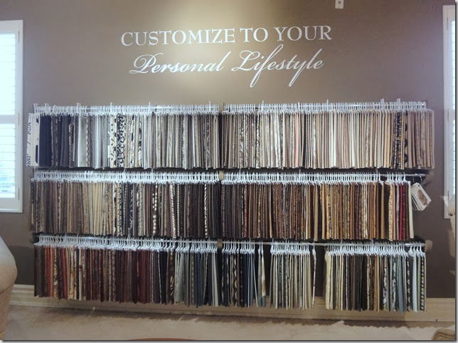
Fabrics - Decor Rest

And more fabrics:

Fabrics2 - Decor Rest

And if you think that leather comes only in shades of brown, you would be wrong.  I would love to see a chair or ottoman in a navy leather.
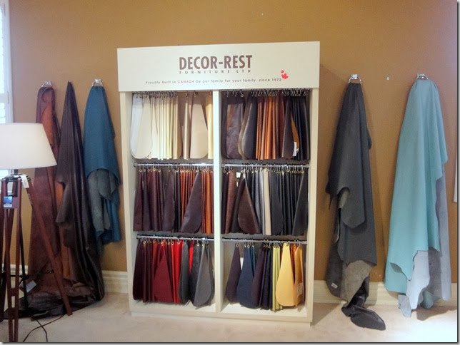
Leather - Decor Rest

Headboard styles:

Headboards - Decor Rest

So, what do you think?  Their furniture is sold in retailers across the country.  You can email info@decor-rest.com to find a store closest to you that carries Decor-Rest furniture.   (Or you can hire me to have access to their trade only showroom just north of  Toronto :) )

I’ll provide more info on how they construct their furniture in the next Decor-Rest post.  Be sure to Like their Facebook page and read updates here.

Have a great week!

Read More
Thursday, August 9, 2012

Style at Home’s 20 Questions With Me!

I’m so happy and honoured to be featured on the Style at Home site answering their “20 questions.”  Over the years, they have asked the questions to a number of talented designers and bloggers.  So, I am thrilled to be amongst them!

Decor Happy

Yes, that would be me on their homepage!

Have a read here and let me know what you think.  I chose “Don’t Stop Believin” by Journey as the soundtrack of my life not so much for the song itself but the meaning of those words – don’t stop believing in yourself/you are never too old/good things happen to those who wait!  (I know as I have been a late bloomer in all aspects of my life!)

Sorry if you have seen this already on Twitter, Facebook, Instagram – not too excited! Thanks for all the cheerleading - really appreciate it!

I’m in Style at Home’s SIP on Organizing which will be out on August 27th! If you live in the Milton area, can’t promise you that you will find it on newsstands as I may be buying them all up! (Yeah, pretty excited!)

 
Read More

Monday, August 6, 2012

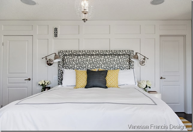
Client Before & After: Fresh+Preppy Bedroom

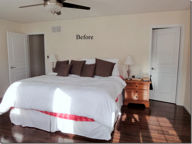
I love working on a room from start to finish – coming up with the design concept and feel and then executing.  This bedroom that I recently completed was a fun project.   This is what we started with:

bedroombefore

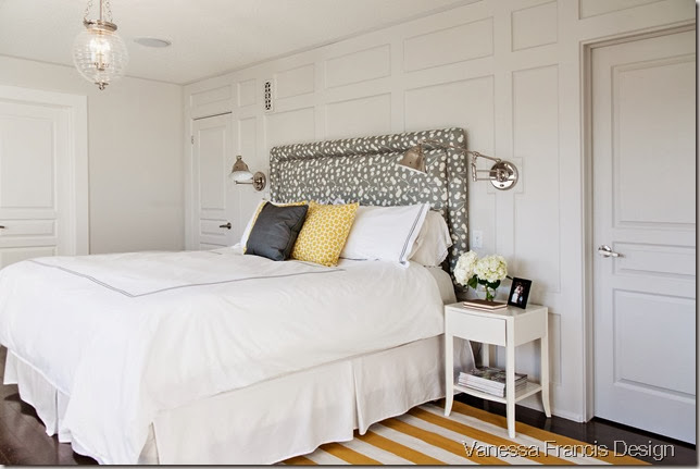
The room needed some architectural presence and I thought that panel moulding/trim would be a great solution. As an example, I showed them Jen’s bedroom and they absolutely loved the panelling and decided to tackle the work themselves. They did an amazing job!

Popplebedroom2
Photo: Leah Kirin

In the Before photo, you can see that the side tables were just too big for the wall with the king bed.  These ones from West Elm were perfect.

The ceiling fixture is one of my favourites that I blogged about here. It is just so pretty and suits this bedroom perfectly.

BURNET_11

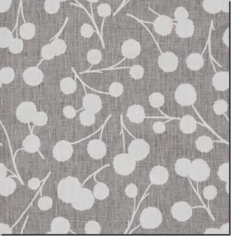
When I showed them this fabric (Thom Filicia for Kravet) for the headboard, they loved it! Paired with nail head trim, it looks amazing with the panelling.  (We used a different colourway of this fabric on roman shades and pillows in other rooms in the house, we loved it so much!)

The pillows and the striped rug from Crate and Barrel in a bold yellow/mustard colour punch up the neutral grey/white/cream palette.

We were all set to commission a painting above the bed but decided the room didn’t need one.

Popplebedroom1
Photo:  Leah Kirin

I loved working on this bedroom with these clients. They were so trusting and wonderful – makes my job so much easier and fun! They said that they feel like they are waking up in a 5 star hotel every day! Love that.
I also worked on other rooms in their house and will show you their dining room in the coming weeks!

Have a great week!

Have a decorating dilemma and don’t know where to start? Contact me at vanessa@vanessafrancis.com
Read More

Friday, August 3, 2012

Guest Post: Tim's Take on "Mr. Decor Happy's Den"

Happy Friday Decor Happy friends!

Today is the last blogger design concept for Mr. Decor Happy's Den and I think you will love it! Tim is an accountant by day and a mad decorator by night (and weekends). His home has been featured in all types of media (TV (Steven and Chris), magazines (most notably, Style at Home) and newspaper (the National Post.) So, you can bet that his moodboard will be genius! Take it away Tim!

Hello Decor Happy readers! So great to see you all again and this time, I am here to share with you all my idea of a "Man Cave".  Being the only male in the crowd actually makes me a little nervous of creating a space that is not "man" enough for Mr. DH compared to the amazing rooms designed by all the talented ladies.  So I decided to go with the "What would Chris and I want for our man cave?" approach, destined to strike the right balance between masculine/ practical functionality and soft/ sumptuous sensibility that would impress Vanessa and her significant other.

Here are a few prerequisites for this man cave redesign:

* West Elm daybed

* Special edition paint by Para Paint

* Love of The Beatles  

* A place to watch TV, read a book, or take a nap

This is the mood board I came up with, and I call it: Whimsy Industrial Chic meets Refined Rustic Glam  

Man Cave

Man Cave by designmazetim on polyvore.com

1.  Jumping Off Point: the overall direction of my man cave design came from this whimsical yet exquisite wallpaper from Clarke & Clarke.  I love the hand-drawn, cartoon-like illustration of landmarks from around the world.  The matte charcoal grey and muted gold pencil line detail sets the tone for a cozy media/den/over-night guest retreat.

2.  Textile Collection: it is no surprise to many that I adore pattern plays and love to inject textile interests via pillows, upholstered pieces and area rugs.  Vanessa and I both love the grey and yellow palette (I kid you not, did you see the Decor Happy banner?) and on that note, I have selected stripe, quatrefoil, and a horse print for a sophisticated look, while the zebra and woodland prints will definitely add a sense of youthfulness to the space.

3.  Daybed Companion: the daybed is fantastic but to maximize the square footage of this multi-purpose space, Vanessa definitely needs additional seating and a coffee table to put her feet up to enjoy a movie or two.  To contrast the hard, geometric frame of the window daybed, I opted for the tufted Chelsea ottoman and the Coco high back chair from Sarah Richardson Design to appeal to Vanessa's chic and elegant design aesthetic.  I would love to see the Coco high back chair upholstered in this grey and cream linen geometric print to echo the window daybed.            

4.  Window Treatment: a black out moment maybe in the cards during those movie viewing moments, so why not add another layer of pattern and color at window dressing? Inverted pleat is my pick for an luxe window delight and Dwell Studio has exactly what I need.

5.  Statement Piece: books, TV, and decorative accessories must co-exist in this space, so why not have an aesthetically pleasing bookcase that provides both open and closed storage to max out clutter control?  I know Vanessa will love the traditional details (i.e. molding, panel, and beadboard) and the library ladder definitely had me at hello.  Similar library inspired bookcases will be available at your local HomeSense locations very soon.  

6.  Showstopper: lighting is important in any spaces and this man cave is no exception.  I am absolutely in love with this Modo Chandelier for its industrial and masculine sensibility.  Let's be real, which man would not want a chandelier like this, if a chandelier has to make an appearance in his life?           

7.  Art Work: this is where "Whimsy Industrial Chic meets Refined Rustic Glam" comes to life with a pop art Beatles print and a hand crafted, sculptural deer head.  Talking about icing on the cake!

This is my man cave idea for Vanessa and Mr. DH.  Well, actually I will have this man cave for myself and Chris in a heart beat.  Thanks so much Vanessa for this fabulous opportunity to share my dream media/den/guest getaway with your readers.  Hope you enjoy this room as much as I do!

Thanks Tim! What did I tell you? I am a huge fan of Schumacher's Chenonceau wallpaper and have had a sample of that charcoal colourway forever. Hmmm...And that light? "If I had a million dollars, I would buy me a light, not just any light..." That Sarah chair is a beaute and in that fabric...dying! Thank you so much Tim for taking time out of your busy life to put this together. 

Stay tuned and I will put together my version of the den taking into account all of the lovely concepts which you can read here.  Did you enjoy this series? Did you have a favourite design or product? Let me know! Would love to hear your thoughts.

Have a wonderful (long) weekend (fellow Canadians!)

Read More

Wednesday, August 1, 2012

Guest Post: Barbara's Take on "Mr. Decor Happy's Den"

Happy Wednesday and first day of August (summer, please slow down!)

 Have you been enjoying the design concepts for my hubby's room so far? I'm loving what everyone has come up with and today is no exception. Barbara is here to show us her take on the room. Welcome Barb! 

With Vanessa wanting to re-vamp her husband's den, aka "man cave" I am thrilled to give her a bit of design inspiration with my vision for the room.


A man cave to me screams leather, woods and animals. 

The whole notion of cave brings to mind a hunter-gatherer, hence I made sure that was represented by the gold resin zebra head and sheepskin rug. The wallcovering is Woods by Cole and Son, my all time favourite wallcover. One day, when we finally buy a house, it will be used somewhere. But for now it is the feature of my man cave.

My man likes to be surrounded by books, not that he reads them, but just like to "have" them. So an Expedit bookcase from Ikea is perfect to hold books, trophies and other manly accessories. And to add a bit of class, an Hermes throw, and Batavia Ikat pillow in Amethyst from Tonic Living, to add that layer of coziness to the tufted leather sofa from Horchow. 

Sources:

8: Tufted leather sofa from Horchow

Good luck with the design of the space Vanessa. Thanks for having me visit and share my moodboard!
XO Barbara

No, thank you Barbara for putting this together. There is no doubt that a man would love this room. I love the floor lamp and the Hermes blanket is on my wish list - one day! The bookcase is a great idea as Mr. DH is an avid reader. Thanks again Barbara!
Read More
Powered by Blogger.

© You Where There Too, AllRightsReserved.
Thanks to Shenmal Fashion Club