Talk about Real Estate, Home Decor, and more related topics.

Tuesday, October 30, 2012

Fabric & Wallpaper: Mr. Decor Happy’s Den

So, I have been slowly but surely working on Mr. DH’s den (aka the “man cave.” ) I received creative and inspiring input from my design savvy blogging friends and took something from each.
After I figured out the layout (it’s a small room, so this was easy), I put my mind to the colour/pattern scheme.  Mr. DH likes navy and grey (and it’s manly – no pink allowed in this room) so I knew those would be the main colours. Interestingly enough, four out of the five blogger moodboards had a shot of orange/tangerine.  So when I spied a linen called “Spice” at Tonic Living, I knew that had to be the “happy” colour in the room to balance the grey and navy.  Even “man caves” need a happy colour so it doesn’t end up looking like, well, a cave! I would call this colour a “burnt orange” as it’s not bright and I think that’s why I like it.
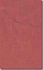
tuscanylinenspice
I fell in love with this Robert Allen fabric (below) and thought it would be perfect on a custom ottoman – every room meant for TV viewing and relaxing needs an ottoman, don’t you think? (I think I have designed one for almost every client’s family room!) I love the ethnic/tribal feel of the fabric.
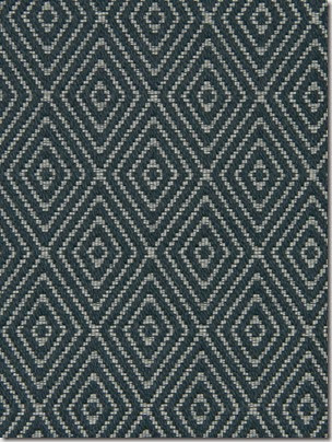
 Decor Happy
I knew I wanted wallpaper on one wall.  I love seeing all walls papered in a room but that is something that I just can’t commit to – so one wall would be enough.  Which wall though?  The idea of papering the TV wall in a dark wallpaper really appeals as in this image below.  The TV just disappears on the Nina Campbell wallpaper.
Black wallpaper makes the TV disappear
Credit: Style at Home
But when I brought home samples of wallpaper with a black background, it just wasn’t Mr. DH’s cuppa. So, then I thought a lighter wallpaper on the daybed wall (the opposite wall.)  That probably makes the most sense anyway since I am only doing one wall.  What wallpaper? How to narrow down the thousands of choices? You know I love floral but this is Mr. DH’s room where he goes to chill, watch TV, read – no florals allowed. What about trees? Trees are manly, right?  I narrowed it down to these two.
Nina Campbell’s new Woodsford papers are beautiful (they are so new that they aren’t even on the Osborne and Little site at the time of writing.)  They have a real hand painted quality and when you touch it you can feel the “paint,” i.e. it’s not smooth.
Woodsford
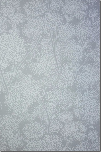
But I have always been a huge fan of Cole & Son’s Cow Parsley papers so when I heard they recently came out with five new colourways, I headed off to Kravet to see them. (One of my first posts included an image with Cow Parsley which I loved.)
Isn’t it lovely? It’s like a mural so that kind of justifies my “one wall” plan. I was going to choose a hex print (you probably know the one I mean!) which was very cool and manly but I think this tree/plant wallpaper/painting is more fitting for a one wall application.
This is how everything will look when complete.  The Daybed is for napping but this room also doubles as a guest room and a room where I can go when Mr. DH’s snoring is too loud. :) (He is not going to be happy when he reads this!)
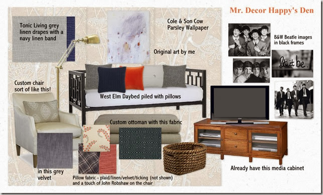
Mr. Decor Happy's Den
As soon as the room is done, it will be revealed in a national newspaper (online), so you have to wait until then!  So, what do you think of the room?  When I do the reveal, I will show you the before – it’s pretty scary and a far cry from this!
Happy Halloween! Hope the kiddos don’t get too wet/blown away.
(And PS – my thoughts are with everyone in the US affected by Hurricane Sandy and dealing with the aftermath. ) 
If you require design/decorating help, please contact me at vanessa(at)vanessafrancis.com.
Read More

Friday, October 26, 2012

Korhani Home Fashion Show

On Wednesday night, I had the pleasure of attending the preview of the Spring/Summer 2013 collection for Korhani Home during Toronto Fashion Week.

The models were sporting beautifully tailored clothing crafted from Korhani Home’s carpets and home accessories.  Once again, they didn’t disappoint with their beautiful and colourful patterns and textures.
This year’s collection showcased three themes each having a distinct feel.
“Belle du Jour” featured Parisian inspired garments/rugs:


The glitz and glam of the roaring 20’s was showcased in “Puttin’ on the Ritz:”
“Tropical Paradise” showcased bright tropical prints fashioned from reversible plastic rugs:

Hard to believe that these are all rugs for the home! Note that the rugs will be available at major retailers across Canada in Spring of 2013.
In my post last year, I mentioned that I would love to attend the Joe Fresh fashion show which was the same night and I guess the universe was listening because we saw that one too (Ok, we snuck in but whatevs!)  I have many Joe Fresh pieces, love their fashion forward styles and affordability plus the added bonus of picking something up while you are grocery shopping!
Gallery Image
All images via here and here. (We were sitting a few rows back so the glare from the lighting meant getting a good enough photo was impossible.)
It was so much fun and I can’t wait to be invited back for the next show! (Maybe next time we will have better seats (with our names on them!) so better photos can be had :)  Just putting that out there!)
Have a happy weekend! (I am working all weekend – it’s that time of year when clients are calling to ready their home for the holidays.)
If you require design advice, please contact me at vanessa(at)vanessafrancis.com.
Read More

Monday, October 22, 2012

Style at Home Limited Edition Collection

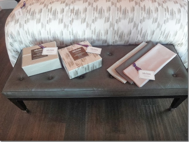
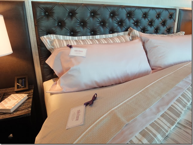
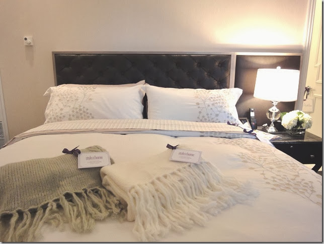
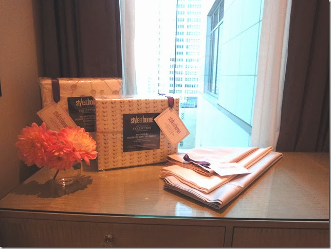
To mark their 15th year anniversary,  Erin McLaughlin and her design team at Style at Home created a Limited Edition Collection of housewares, bedding and bath so that you can have a well-styled home too.
You may have already seen my instagram photos or heard about this via my lovely blogger friends that were in attendance with me at the preview.  These products are still available and would be a nice addition to your home or make a great Xmas/holiday/hostess gift.
sah-collection-ceramic-vase.jpg

sah-collection-serving-bowls.jpg

sah-collection-tray.jpg
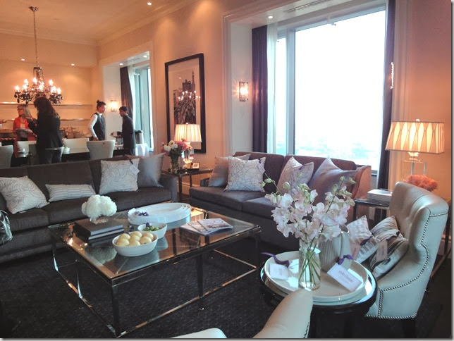
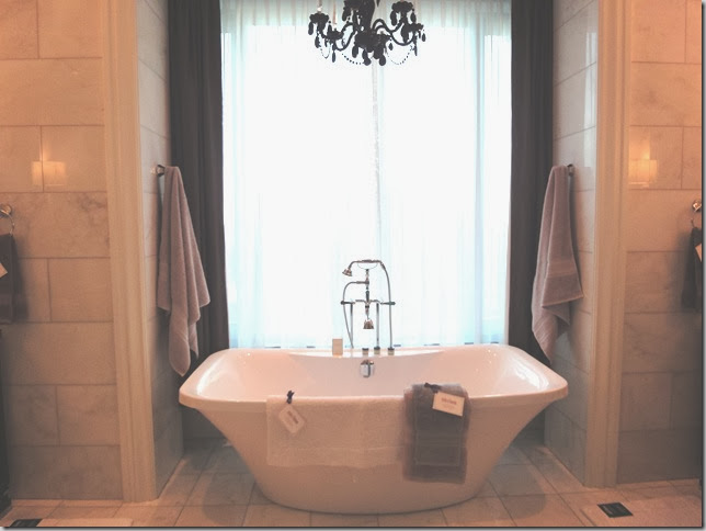
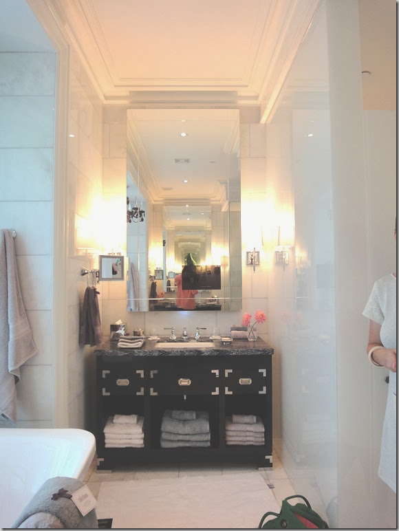
I snapped the photos below of the products which look right at home in the beautiful Trump hotel suite we were in.

DSC04527 

DSC04513 

DSC04515

DSC04518 

DSC04519 
 DSC04523
 
DSC04525

All of the items in the collection are stylish and affordable too. But hurry as this is a limited collection so when they are sold out, that’s it.  Go here to see the entire collection and order!

Happy shopping!
Read More

Monday, October 15, 2012

Monday Meandering & Giveaway Winner

And here we are again! It’s Monday, the middle of October already! Hope you had a happy weekend!

1) My latest Houzz ideabook is live and it’s entitled “20 Finds for Staging Your Home” or just to freshen up your home and add personality.

floweronwall01_yangyangpan
I love this print by Yangyang Pan – the vibrant colours and composition are brilliant.  I have recently commissioned her to create an original painting for one of my client’s and can’t wait to see it when it’s finished.

2) Last week, I attended a book signing at CB2 hosted by Style at Home with none other than Bob and Cortney Novogratz.   Their latest book, “Home by Novogratz” features 20 homes that they have decorated so that you too can get the “Novogratz look.”  Read my interview with them here and read more about the event and enter to win a copy of the book in Style at Home’s post here.

DSC04592Yep, just a regular night hanging out with our besties. :)  They were so charming and friendly and it was surprising to hear that even though they have lived in NYC for the past 20 years they have never visited Canada.

DSC04595
This table, chairs and area rug are part of their collection with CB2.

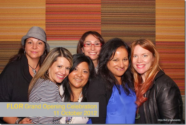
3) That same night, we attended the opening of the FLOR Toronto store. FLOR creates 20” x 20” modular carpet tiles in all sorts of cool patterns and colours.  You can arrange them to create one of a kind area rugs and runners. Here’s a fun photo of my girls and I at the photo booth – note the floor tiles in the background.

flor-snapshot-photo-booth-M 
4)  The winner of the $200 Paint it Like New Giveaway (chosen by random.org)  is Michelle of Sweetsuite 10.  Congrats! Please email me so that I can pass along the details to you.  And please be sure to send me the Before and After!

Have a happy week everyone!

If you require decorating/design advice, please email me at vanessa(at)vanessafrancis.com.
Read More

Monday, October 8, 2012

Happy Thanksgiving!

Just popping in to wish  my Canadian friends a Happy Thanksgiving and a Happy Columbus day to my American friends. And I’m sure I’m missing holidays in other parts of the world, so Happy Day everyone!

via

And with that, I say thank you for reading Decor Happy! It means a lot that you would take time out of your busy lives to read my posts and I really appreciate that!

We’re heading to my Mom’s to celebrate Thanksgiving today.  So looking forward to seeing everyone and enjoying mom’s home cooking. Hope you have a family-filled fun day!

(PS I have been working on Mr. Decor Happy’s Den and will share the design with you this week.

Also, there’s still time to enter the Paint it Like New giveaway here and take advantage of the Geovin sale here.)

Read More

Friday, October 5, 2012

Building Hope: A Home Depot/Habitat for Humanity Build

Being involved in a Habitat for Humanity build has always been on my bucket list of things to do.  So when the folks at the Home Depot/Home Depot Canada Foundation contacted Jennifer and I to walk through two of the homes that were being built, we both jumped at the chance.  (Next year, we’ll participate in the actual build, right Jen?)

I’m sure most of you have heard of Habitat for Humanity but on the off chance that you haven’t, they build affordable housing for families in need.  Their vision is simply:

A world where everyone has a safe and decent place to live.

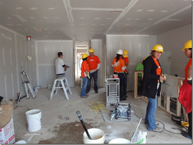
For the past 10 days, (you read that right, 10 days!) Habitat for Humanity Toronto and The Home Depot Canada Foundation  constructed two fully-accessible, semi-detached houses from the ground up.  Over 300 Home Depot employees participated in the building blitz which provided two deserving Toronto families with simple, affordable homes just in time for the Thanksgiving weekend.

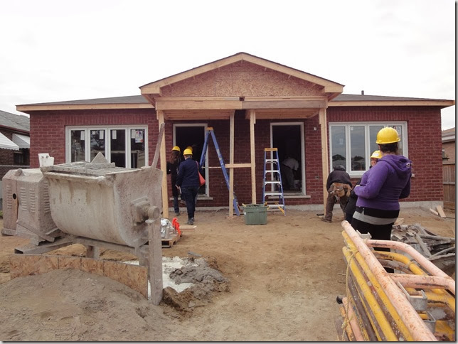
DSC04578

This is how the home looked when we arrived Tuesday morning.  Just eight days before that, it was a plot of land.  

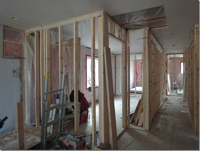
DSC04556


DSC04560

A room with a view and a place where dreams can be made:

DSC04565 
The interior of the other house which was farther along.  These are corporate Home Depot employees volunteering their time and expertise - what a great team building exercise!

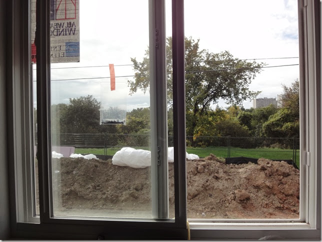
DSC04571

A backyard backing onto trees.  

DSC04574

And this is the completed house yesterday just after when the keys were handed over to both families.  It was taken via a camera that provided real time images during the duration of the build:

HabforHumanity


DSC04553

(L to R) Erika Botond | The Home Depot Canada, Angela Solomos | Habitat For Humanity Toronto, me, Paulette Minard | The Home Depot Canada Foundation, Jennifer Hills | The Home Depot Canada, Jennifer
Angela was so inspiring to listen to and had so much passion for what Habitat for Humanity stands for – not just building homes but building hopes and dreams for the future of the families.

Thanks for this opportunity ladies!  It was truly inspiring!
Read More

Monday, October 1, 2012

Wallpaper + a Guest Post

Happy October 1st!  Hope you had a great weekend (and week for that matter as blogging took a back seat to client work these past few days.)

My friend Tim did a wonderful post on my home last week for his “Our Home” series. He even showed a couple of spaces that I haven’t shown on the blog before. I have shown sneak peeks on Instagram (follow me so you can see them too!)

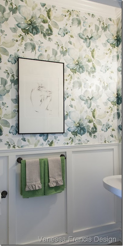
bathroom-16
 Photo credit:  Leah Kirin

This is my powder room now with a bold blue and green floral wallpaper and an original drawing from a local artist.  I can’t tell you how much I love it and I love hearing people’s (positive)reactions when they open the door. 

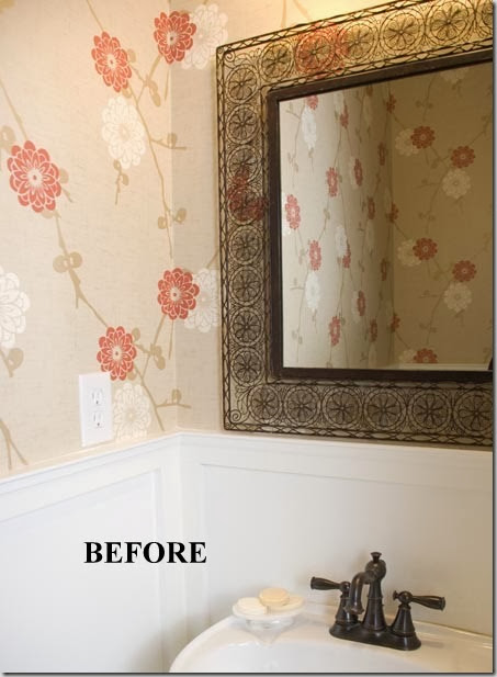
Below is the previous wallpaper which I liked for the six years it was up but when it comes to decorating “change is good” is my mantra. I think what I like about the new wallpaper is that the background is an off white so it looks fresh whereas the previous one had a beige background and it looked a bit dingy. (Also, and I had no idea – the wallpaper below was hung upside down all these years! It’s hard to notice but yes, I see it now.) 

I’m thinking of changing out the mirror or painting it navy and I am also looking for a new light fixture.

powderroombefore

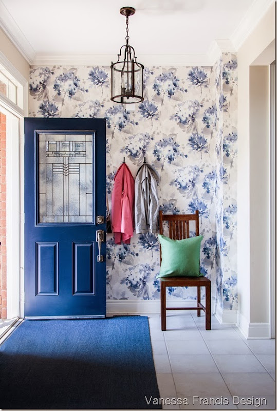
hall-04-e
Photo credit:  Leah Kirin

This is my small entry way with another bold floral wallpaper although this one has a watercolour effect. 

When you enter my home, you really get a sense of what my favourite colour is! (PS One day I will change my front door to something other than the standard builder issue.  I have painted it a few times though!)

Speaking of Tim, he is featured in the new Style at Home special issue (available on newsstands only) called “100+ Easy Renos & Makeovers.”  Like me, he is a serial decorator and always changing things up in his home. So, make sure you pick up the issue to see what he has been up to.  Oh, and for my US readers, I just heard that the Organizing issue that I am featured in is on select newsstands there.

There’s still time to enter the Paint it Like New giveaway here and take advantage of the Geovin sale which you can read about here.

Hope you have a wonderful week!

If you have a room in your home that requires attention, please contact me at vanessa(at)vanessafrancis(dot)com. The cut off date for ordering furniture before Christmas is rapidly approaching!
Read More
Powered by Blogger.

© You Where There Too, AllRightsReserved.

Thanks to Shenmal Fashion Club