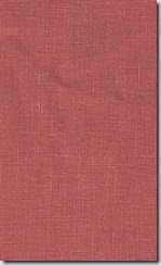
After I figured out the layout (it’s a small room, so this was easy), I put my mind to the colour/pattern scheme. Mr. DH likes navy and grey (and it’s manly – no pink allowed in this room) so I knew those would be the main colours. Interestingly enough, four out of the five blogger moodboards had a shot of orange/tangerine. So when I spied a linen called “Spice” at Tonic Living, I knew that had to be the “happy” colour in the room to balance the grey and navy. Even “man caves” need a happy colour so it doesn’t end up looking like, well, a cave! I would call this colour a “burnt orange” as it’s not bright and I think that’s why I like it.

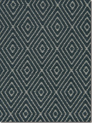
I fell in love with this Robert Allen fabric (below) and thought it would be perfect on a custom ottoman – every room meant for TV viewing and relaxing needs an ottoman, don’t you think? (I think I have designed one for almost every client’s family room!) I love the ethnic/tribal feel of the fabric.

I knew I wanted wallpaper on one wall. I love seeing all walls papered in a room but that is something that I just can’t commit to – so one wall would be enough. Which wall though? The idea of papering the TV wall in a dark wallpaper really appeals as in this image below. The TV just disappears on the Nina Campbell wallpaper.
Credit: Style at Home
But when I brought home samples of wallpaper with a black background, it just wasn’t Mr. DH’s cuppa. So, then I thought a lighter wallpaper on the daybed wall (the opposite wall.) That probably makes the most sense anyway since I am only doing one wall. What wallpaper? How to narrow down the thousands of choices? You know I love floral but this is Mr. DH’s room where he goes to chill, watch TV, read – no florals allowed. What about trees? Trees are manly, right? I narrowed it down to these two.Nina Campbell’s new Woodsford papers are beautiful (they are so new that they aren’t even on the Osborne and Little site at the time of writing.) They have a real hand painted quality and when you touch it you can feel the “paint,” i.e. it’s not smooth.
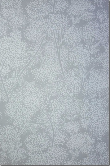
But I have always been a huge fan of Cole & Son’s Cow Parsley papers so when I heard they recently came out with five new colourways, I headed off to Kravet to see them. (One of my first posts included an image with Cow Parsley which I loved.)
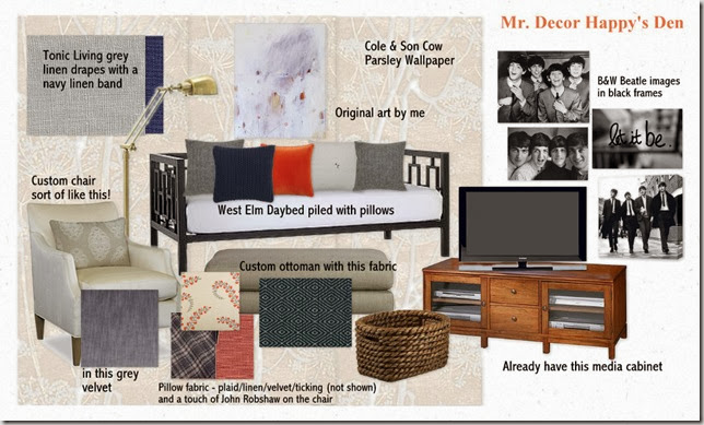
This is how everything will look when complete. The Daybed is for napping but this room also doubles as a guest room and a room where I can go when Mr. DH’s snoring is too loud. :) (He is not going to be happy when he reads this!)

As soon as the room is done, it will be revealed in a national newspaper (online), so you have to wait until then! So, what do you think of the room? When I do the reveal, I will show you the before – it’s pretty scary and a far cry from this!
Happy Halloween! Hope the kiddos don’t get too wet/blown away.
(And PS – my thoughts are with everyone in the US affected by Hurricane Sandy and dealing with the aftermath. )
If you require design/decorating help, please contact me at vanessa(at)vanessafrancis.com.


