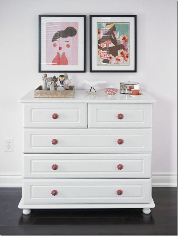
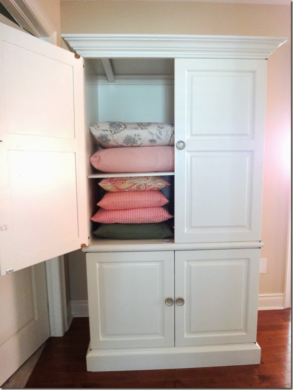
- Leave a comment and tell me what you would like to have painted. (And if you haven’t hit the blue “Join this Site” button in the sidebar on the right yet, I would appreciate it if you did! That way you won’t miss any updates including finding out if you are the winner!)
- For an additional entry, “Friend” Paint It Like New on Facebook and leave an additional comment letting me know.
Note: If you don't have a blog and/or your email isn't evident, please include in your comment so I can get in touch with you if you win!
Monday, September 24, 2012
Sponsor Giveaway…Paint It Like New
Friday, September 21, 2012
Where I’ve Been…etc.
Friday already? Thank goodness!
1) You can find me over at the Fieldstone Windows blog where I share what’s been catching my attention lately (and that of every other design blogger!)
2) House and Home wrote a fun post about the event at the Princess Margaret Showhome. You can read it here. I have my (winning) ticket – do you have yours?
(I really must stop wearing these shapeless tops – even though I love this one from Top Shop in NYC. You don’t realize until you see a photo of yourself, how unflattering they are! )
3) I attended a trade show for designers and decorators this week. Besides catching up with designer friends, I loved seeing all the new fabrics for Fall 2012. You know I’m a big fan of grey and yellow/mustard as shown in this bathroom and this bedroom, so when I saw these, I was very happy. I can see them on a headboard, chairs and you may just see them in Mr. Decor Happy’s Den. They are even more gorgeous in person. Fun, right?
4) Don’t forget about the Geovin Sale! Pop by the store this Saturday, if you get a chance!
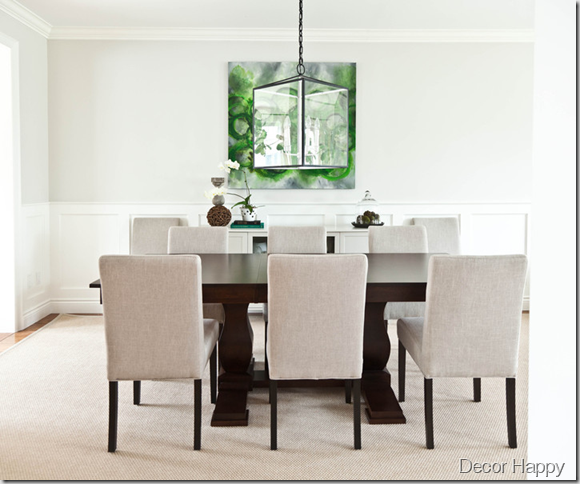
Have a happy weekend!
If you need help creating the room of your dreams, please contact me at vanessa(at)vanessafrancis.com.
Wednesday, September 19, 2012
Sponsor News: Geovin Furniture Sale
Happy Wednesday!
I’m happy to announce that Geovin Furniture is offering 20% off their furniture for Decor Happy readers until October 15th. How great is that? (You can also show the flyer on your phone rather than printing it!)
It’s not too early to be shopping for furniture for Christmas as lead time is often 8-12 weeks.
They have just moved to a new showroom and are showcasing their new products. I am in love with many of their pieces including this upholstered headboard:
And this dining table which I have used in a project to be shared soon!
I can’t say enough about this company and their Canadian made, solid wood furniture. You can read a previous post here and see a dining makeover here.
If you have any questions, feel free to email me at vanessa(at)vanessafrancis.com. Happy shopping!
Monday, September 17, 2012
Getting Organized…in the Home Office
Happy Monday! Was that not the most beautiful Fall weekend weather? A little shout out to Mr. Decor Happy who ran in our local half-marathon yesterday. So proud of him and all of the other runners including an 81 year old runner who set another world record! So inspiring!
Seeing as I was featured in print in an “Organizing” issue, thought I will share some organizing tips now and then.
On one side of my home office is cabinetry and workspace which I blogged about here. (It’s getting a little makeover too as I replace the desktop with stained wood.)
photo credit: Leah Kirin
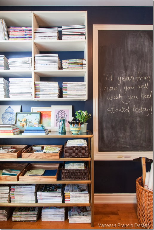
And on the other side of the office is a bookcase on the wall which I installed years ago so that I could place my drafting table below it. I wasn’t really using the drafting table any more so I was on the hunt for a shelving unit to fit the space. I was looking for specific dimensions in a specific finish and it was impossible to find.
This is when having something custom made is the best solution. So I contacted Vie from Anvil Wrought Iron and we created this bookcase called the “Vanessa.” :)
I wanted to have a place to store trays for client samples along with their files. It really is the best way to keep this organized on current projects – everything is together in one spot and I know where to quickly find it. (I’m actually on the hunt for smaller trays (15”x15”) so I can fit three across.)
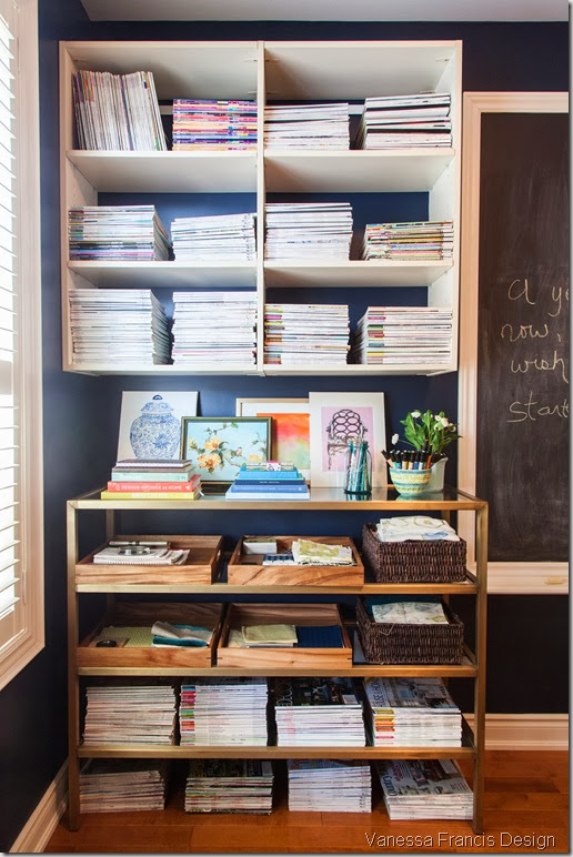 Photo credit: Leah Kirin
I also have space to house fabric samples, and art, books etc on the top shelf. The art is from Etsy and a thrift shop of all places.
Yes, I know I have a bit of a magazine obsession – this is only a portion of it, the rest is in my family room and bedroom!
You can’t tell from the photo but the bottom shelf is mirror and the rest is glass. (I’m going to switch the mirror shelf to the top shelf so it is more visible.) I love the aged brass finish.
The gorgeous navy paint wall colour which I absolutely love is Para’s Straight Leg P5157-75. I’m so glad I didn’t go any darker towards black as was my original intention.
Well must go, I’m inspired by all those runners I cheered on yesterday, and am off to the gym!
Have a happy week! I’ll be back with a message from one of my sponsors mid-week, which you won’t want to miss!
Wednesday, September 12, 2012
Anatomy of a Living Room
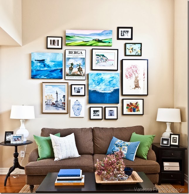
Just thought I would share this photo of my living room in case you didn’t get a chance to see it in the Style at Home Organizing issue which is on newsstands now.
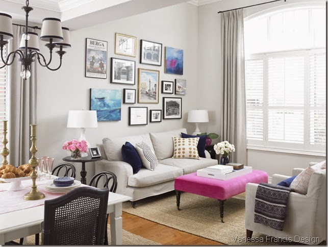
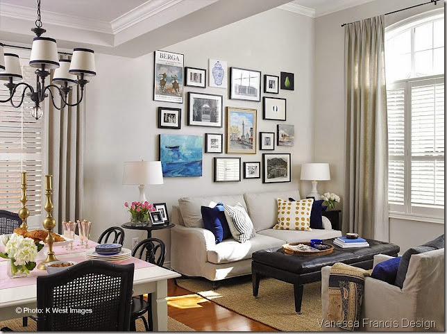
It’s funny, people are still pinning this image below of how my living room looked last year pre-slipcovers etc. It looked great then but I am finally happy with it (the curse of being a decorator, blogger, pinner…) and wouldn’t change a thing now (much to hubby’s happiness!)
Monday, September 10, 2012
Princess Margaret Lottery Showhome 2012
Happy Monday! Hope you had a fun weekend!
Last week, I was invited to a Blogger Preview of the Princess Margaret Lottery showhome which is now open to the public. Once again, Canadian House and Home designed and decorated the 6,500 sq’ home located in southeast Oakville, Ontario.
Here are my top 6 picks of what I loved. But don’t listen to me, do go visit if you are in the area!
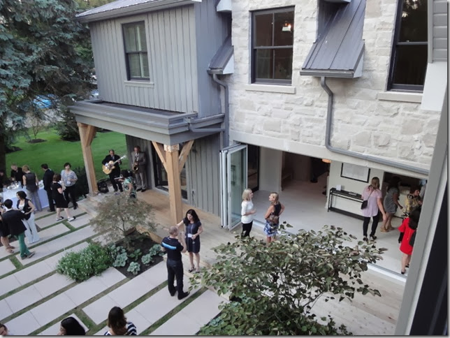
1) The exterior and backyard: It was a beautiful night with music, drinks, appetizers, great company and of course the gorgeous surroundings. I love the stone and siding, the folding door system and the patio stone/grass.
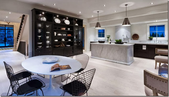
2) The marble clad island with my favourite pendants and the grand wall unit/hutch. The base cabinetry is from Ikea, by the way!
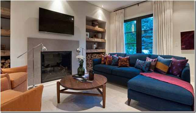
3) The study with an indigo sectional (from Crate and Barrel) and silk ikat pillow fabric. Note the metal doors painted in Benjamin Moore’s Black Jack.
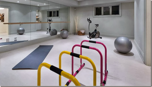
4) As a former yoga teacher, this home gym/yoga studio is just perfect!
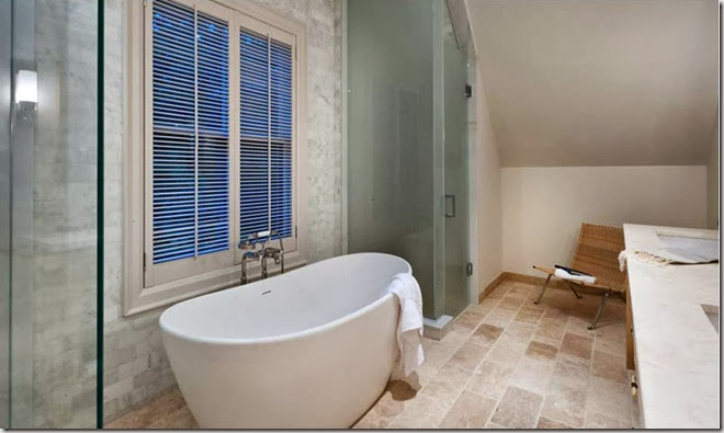
5) The sculptural bathtub in the ensuite. Notice the small (1”) louvers on the shutters – much nicer than the bulky 3-4” ones. Do I spot a trend?
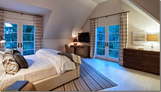
6) Interior doors: I was a little fixated on all of the doors like these French doors in the principal bedroom. It would feel like you are living in a treehouse with all of the greenery outside.
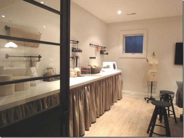
And these doors to the sewing room/laundry room.
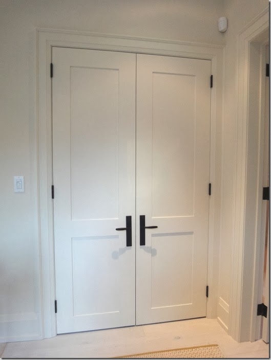
These simple shaker interior doors are a nice change from the standard builder doors which usually have a raised profile:
All photos by PCM (the builder) except the backyard, laundry room and interior door photo above taken by me.
(PS I am biting the bullet and buying a camera shortly – a real “big girl” DSLR. No more crappy pics from my point and shoot.)
You can see professional shots of the house in the October House and Home and you can watch videos here. And you can still sign up for free seminars with the talented House and Home folks here.
Also, you can read my posts on the prior year showhomes here. Yes, I am a big supporter!
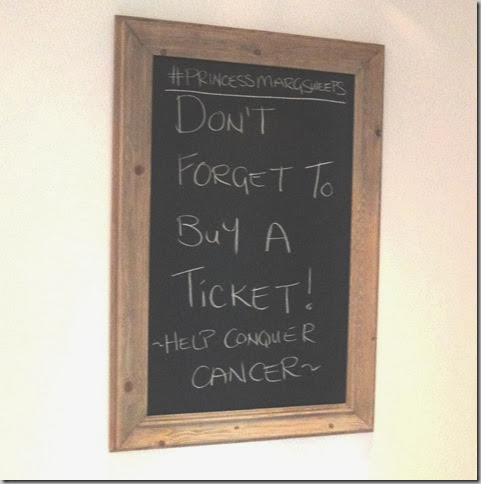
Hurry up and get your ticket (I’ve got mine!), deadline for the VIP draw with the chance to win a trip to Hawaii is Sept 14th. Even if you don’t win, your lottery ticket purchase will “help conquer cancer.” Let’s make that a goal in our lifetime!
Have a happy week!
Tuesday, September 4, 2012
Eight Ways to Update/Decorate a Dining Room
Happy back-to-school day (if you have kids)! (My daughter isn’t actually back to school until Wednesday but most school boards are back today I think.) It’s always a bittersweet time – happy to be able to get back to work and the routine; but sad that there is an end to the sleeping in, biking, beach and lazy days of summer!
I do love September though and all of it’s possibilities!
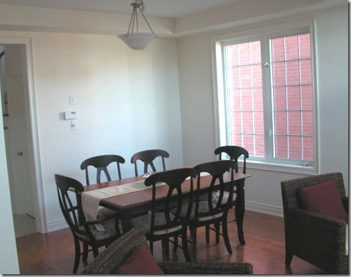
If you have been following along, you may have seen a number of iterations of the living room half of my living/dining room. (I also have a family room which I have shown bits and pieces of.) I have never shown the dining room side before though.
This is the very embarrassing BEFORE shot taken when we moved into the house 7 years ago. The dining set is Canadian made and was purchased about 10 years ago. Oh, and see those chairs in the foreground? I had them slip covered which you may have seen in the Style at Home feature.
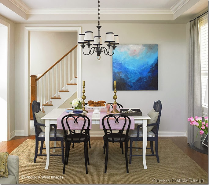
I know, right? But don’t worry, it only stayed that way for a few weeks! And this is how it looks now (this photo was taken in March of this year right after the Steven and Chris shoot.)
Photo credit: K West Images
(In case you are scrolling back and forth – yes it is the same space but my photographer photoshopped the thermostat etc. out. They don’t really add to the pretty pic and that’s why you will rarely see them in magazines!)
Eight Ways to Update a Dining Room:
1) Paint furniture: I had the table professionally sprayed an off-white shortly after the Before pic was taken. I still loved the clean lines and curvy legs but wasn’t fond of the wood tone. Paint it Like New is a great resource.
2) Break up the set: I found the two cane-back end chairs in a vintage store, had them sprayed a dark blue and reupholstered in a stripe fabric.
I have always loved bentwood chairs especially these ones with the “heart” back. They are made in the same factory in Europe where the original Thonet chairs were made in the mid 1800’s. (Remember, SJP had one in her gorgeous Hampton beach house.)
If you live locally and are interested in purchasing the chairs in the Before pic, let me know. A coat of paint and new fabric on the seats and you will have a well-made set of chairs!
3) Update the lighting: I had Lia change the fabric on the shades to an ivory linen and add navy ribbon to them. Getting a new chandelier wasn’t in the budget and I wasn’t entirely tired of this Restoration Hardware one (purchased 7 yrs ago.)
4) Hang bold original art: This is a custom piece by Andrada. Her original paintings are extremely affordable and add so much life to a space.
(The space is really tight so I have been on the hunt to find a very slim console table to place under the painting. Actually, what I really want for that space is a piano. I used to play and my daughter wants to learn. It’s the only inside wall where it could go. I went piano shopping the other day and I may have to put that on hold for awhile!)
5) Add Drapery panels: The custom linen/blend drapes layered over the shutters finish off the room.
6) Find one-of-a-kind pieces: I found the oversized brass candlesticks from the 1930’s (so I was told) at the Aberfoyle Antique market. Adding a few accessories with patina adds charm and character.
7) Paint the walls: I recently changed my walls to this light grey colour called Fan Light Grey from Para. It instantly freshens up the room.
8) Add texture: I don’t usually advise clients to place an area rug under a dining table (because of the crumbs/spills) but in my case I wanted to minimize the orange tone of the hardwood floors. Plus, the dining room rarely gets used as we have a dining table in our kitchen! This jute rug from West Elm is inexpensive and adds a ton of texture.
What are your tips for updating a dining room?
Have a wonderful week!
