Talk about Real Estate, Home Decor, and more related topics.

Wednesday, September 12, 2012

Anatomy of a Living Room

Hi there!  Hope you are well! There is a nasty bug going around and my little one (actually, she’s almost as tall as me!) has it. I have been drinking lots of orange juice in the hopes that I don’t get it.

Just thought I would share this photo of my living room in case you didn’t get a chance to see it in the Style at Home Organizing issue which is on newsstands now.
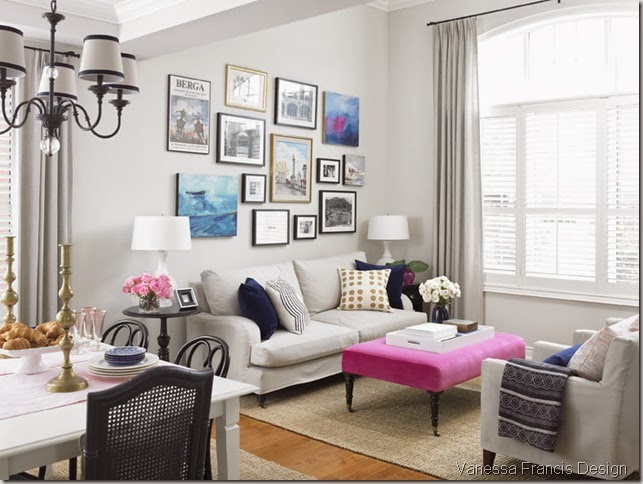
Vanessa Francis Design
Photo credit:  Kelly Horkoff

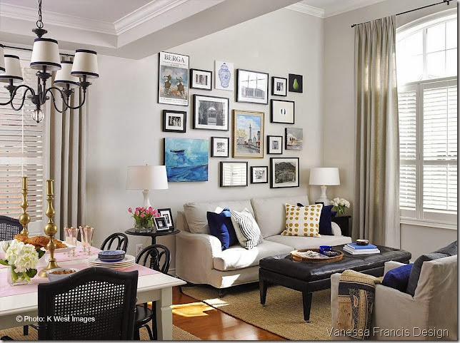
The above shot was taken in July and is how it looks now. The one below is how it looked for the Steven and Chris show and was taken in March of this year. I had purchased the leather ottoman from Crate and Barrel and although I do love the piece (and have recommended it both in the rectangular and square forms to clients), it was taking the room in a more masculine direction than I wanted. The room also needed another colour to play off the shades of blue. I had some pink going on in the adjoining dining room which I blogged about here. I then sourced the perfect pink velvet fabric for the ottoman from Kravet. Just the hit of colour the room needed!

Vanessa Francis Design 2
Photo credit:  Kelly Horkoff

The other big change to the room was the art gallery wall. When the photo above was posted on the Steven and Chris Facebook page, someone commented that the gallery wall was too busy.  And I know you shouldn’t take every negative comment to heart – because we decorate for ourselves and not others – I totally agreed.  So I moved things around (for about the 10th time in a couple of years!) and reduced the number of pieces from 17 to 13. 

I kept four of the original art pieces and added another two created by myself.  The art wall needed to repeat the hot pink colour so I painted “Two Hearts” (because when I was done it kind of looked like two adjoined hearts) in the upper right corner (of the top photo.)

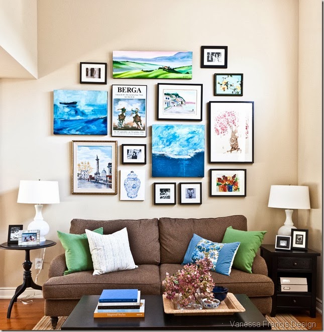
It’s funny, people are still pinning this image below of how my living room looked last year pre-slipcovers etc. It looked great then but I am finally happy with it (the curse of being a decorator, blogger, pinner…) and wouldn’t change a thing now (much to hubby’s happiness!)
livingrm-1cropped
Photo credit: Leah Kirin

What do you think? And are you constantly changing things up in your own home – always trying get that “Ahhh” moment when you’re done?  Do you have one room that is always being changed up more so than others?
Stay tuned, I will be posting my new and improved powder room soon – I changed out the wallpaper and it looks amazing (to me, anyway!)

If you need decorating help, please contact me at vanessa(at)vanessafrancis(dot)com.
Powered by Blogger.

© You Where There Too, AllRightsReserved.

Thanks to Shenmal Fashion Club